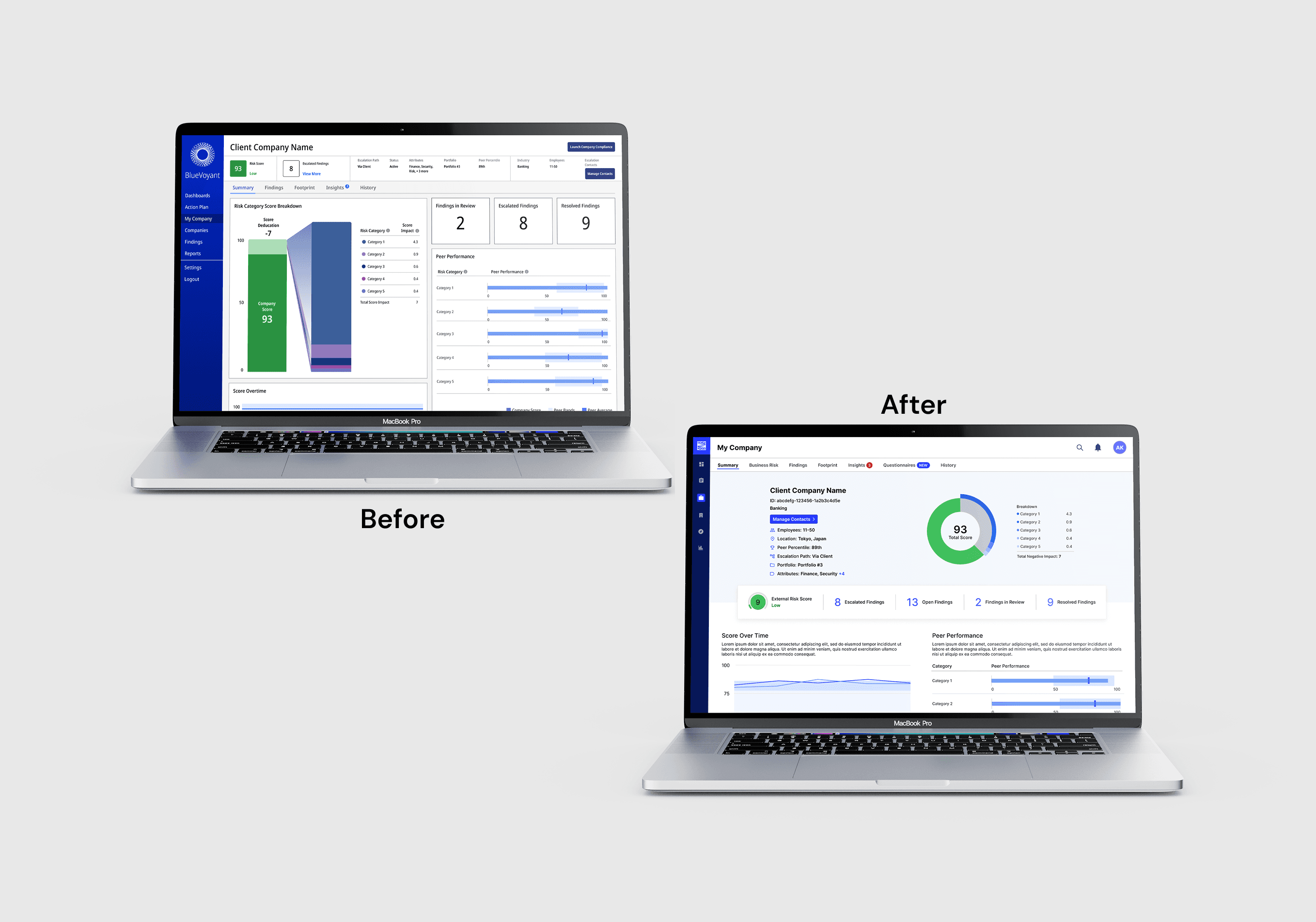
One of BlueVoyant’s key platform pages was consistently underperforming. Users, including both internal teams and external clients, reported frustration and confusion finding essential information. This was a high-impact issue, as the page was central to daily workflows and client reporting. The company needed a clearer, more actionable experience to reduce support burden, improve client satisfaction, and streamline internal use.
Challenges
Confused users meant more support tickets and slower decision-making.
Wasted screen space and misaligned priorities buried important insights.
Inconsistent UX across pages created friction and inefficiency.
My Approach
Identified the Core Problem
The main issue was that critical data was being lost in noise. Users couldn’t quickly see what mattered. My first step was to collaborate with data analysts and customer-facing teams to pinpoint exactly which metrics users relied on most.
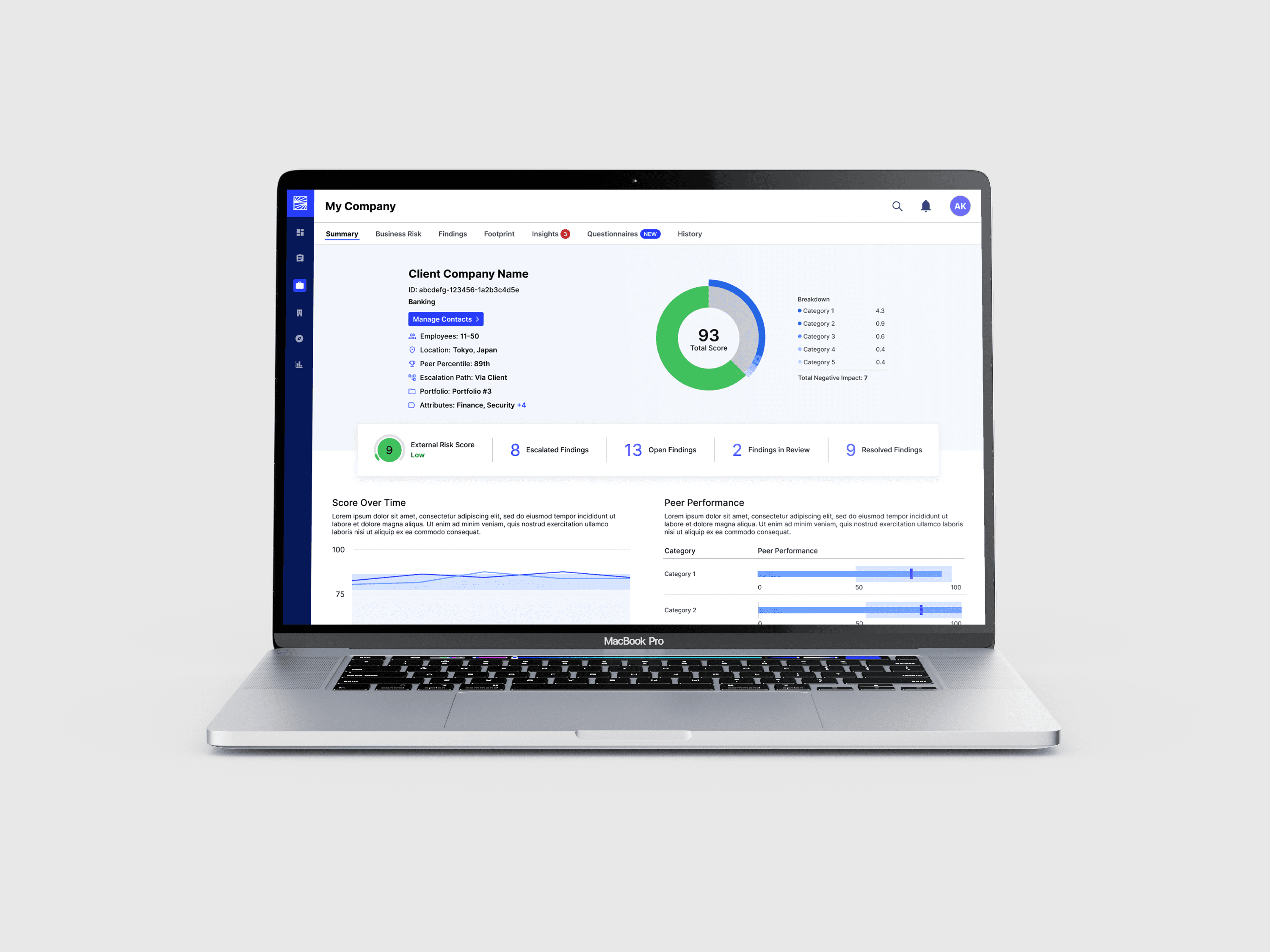
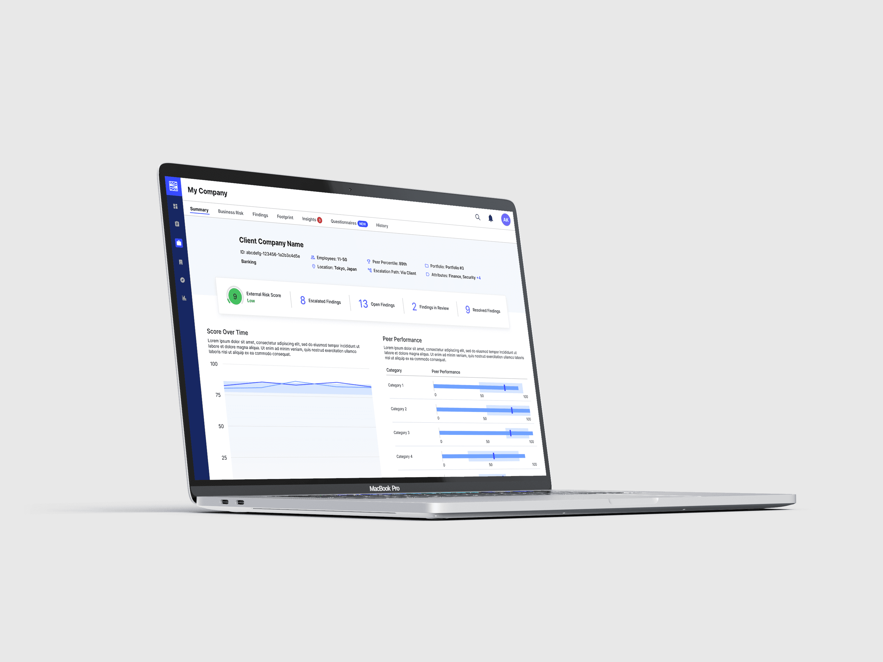
Simplified & Focused the Page
I restructured the page to:
Reduce unnecessary data in the header
Introduce a cleaner, more intuitive chart (an interactive donut chart)
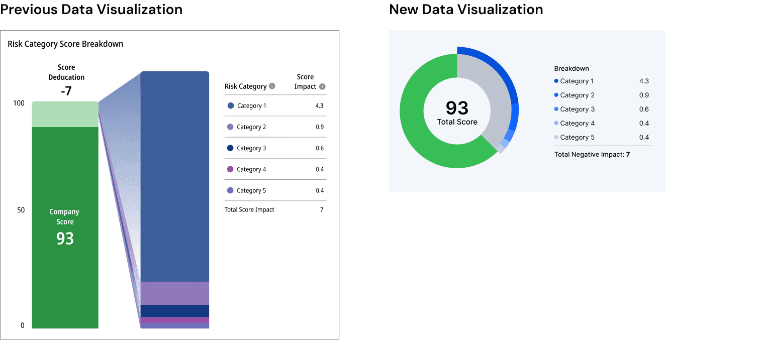
Reorganize content so high-priority information appeared first
This wasn’t just a visual improvement. It made the page easier to scan, faster to use, and more aligned with business needs.
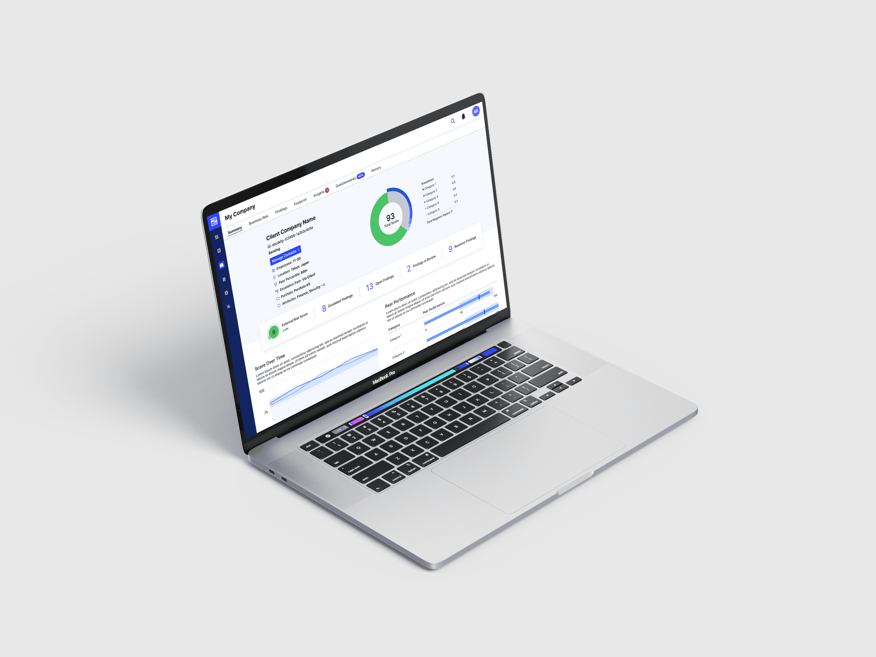
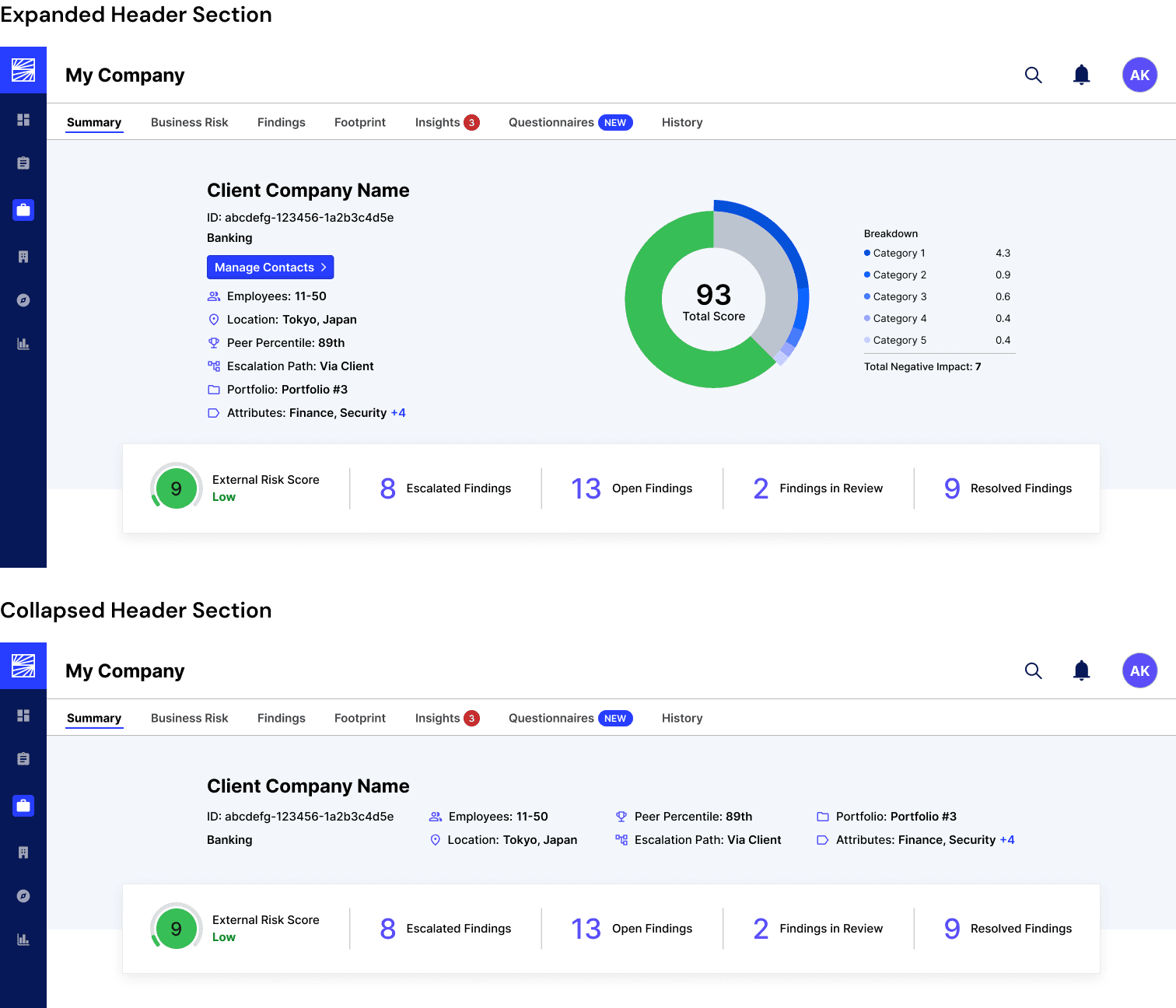
Built for Scale
The redesigned header wasn’t a one-off fix. I created two flexible versions, full and condensed, and added them to the design system. This allowed the solution to scale across other platform pages, saving development time and ensuring consistency.
Collaborated for Validation
Throughout the process, I worked closely with analysts and customer success managers to test assumptions and gather feedback. Their insights helped me make smarter decisions about content prioritization and layout.
Results
30% increase in task completion
20% decrease in total time spent on page
60% reduction in support tickets
Reduced visual noise led to quicker user comprehension
New design system components are now used across multiple product pages
Improved internal sentiment: Client-facing teams reported clearer communication and fewer complaints
More usable product overall, supporting broader platform modernization goals
Future Plans
User feedback from this redesign is actively informing updates to other platform areas. The goal is to continue scaling what works (clearer layouts, prioritized data, and reusable components) across the entire product ecosystem.
Conclusion
This project was about more than just a cleaner interface. It helped the company reduce confusion, save internal resources, and create a more professional, client-friendly experience- one that better supports BlueVoyant’s role as a trusted cybersecurity partner.