reviewery is a vocabulary learning app designed and tailored for each students individual learning needs.
Challenge
Solution
Responsibilities
Many students struggle to find a way to study that is both fun and engaging. Users need a simple and inviting way to learn new vocabulary.
Design a personalized app that allows users to create their own vocab sets, as well as have sets created by others recommended to them.
Competitive Analysis
User Interviews
User Personas
User Flows
Information Architecture
Wireframes
Usability Testing
Prototyping
Mockups
Final Deliverables
Tools Used
Adobe XD
Adobe Photoshop
Usability Hub
Google Forms
reviewery
Doing an analysis of three other vocabulary learning apps on the market allowed me to gain a better understanding of what to include in reviewery and which features should be left out.
Understand
Competitive Analysis
Research
Ideate
Test
Design
Understand
Feature
Quizlet
Chegg Prep
AnkiApp
Need an account to use
Easy to navigate
Study variations
Ability to organize sets
Shows study history
Offers privacy settings
No ads
I completed interviews with 5 participants. I sorted their answers into high, mid, and low priority needs to take into consideration when I determine what needs to be included in the app. All of the participants were students at the time of their interview, which is my target audience.
Understand
Interviews
High Priority
Users need a simple way to create new vocab cards and sets so they don’t waste time
Most interviewees learn by doing, so there should be options for users to study in non-traditional ways
Mid Priority
Users need to be able to study for both short and long periods of time depending on their schedule
Users want a visually appealing and intuitive interface
Low Priority
Most users learn better when they set time goals, so there should be a way to do this within the app
With the data from the user interviews, I created a persona that portrays the average user. Understanding the persona helped me to make design decisions that put the user at the center of everything.
Research
User Personas

Cari Jones
Job Title
Nursing Student & Part Time CNA
Relationship Status
Single
Age
20
Location
Minneapolis, MN
Introvert
Smart
Determined
Distractible
Motivations
Simplicity
Learning
Convenience
Entertainment
About
Goals
Frustrations
“I struggle with learning new vocabulary for school because I get bored. I need a better way to study and prevent myself from getting super distracted.”
Cari is a full time student studying to become a nurse. She struggles to find a balance between work, school, and having a social life. Because of this, she has a limited time to do homework. She’s kinesthetic learner and typically prefers to study alone.
Become a better student by forming more productive study habits
Find a simple and engaging way to study
Gain confidence in her ability to retain knowledge from studying
Doesn’t have a lot of time to study
Having a hard time finding a way to study that holds her attention long enough for studying to make a difference
This user flow demonstrated the user’s journey from initially downloading and opening the app to creating their first set.
Ideate
User Flow
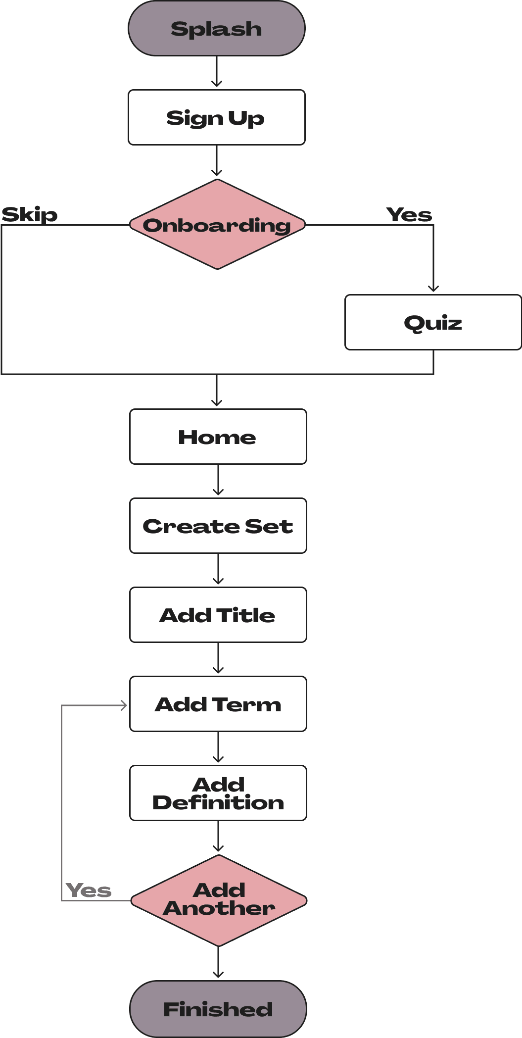
After creating a user flow, I was able to expand on the criteria for reviewery to create a full site map.
Ideate
Information Architecture
Splash
Log In
Search
Results
Sign Up
Onboarding
Create Set
Add Title
Add Term
Add
Definition
Repeat/
Finish
View Sets
Study Set
Home
Jump
Back In
Your Sets
Recommended
Trending
Profile
Edit Profile
Settings
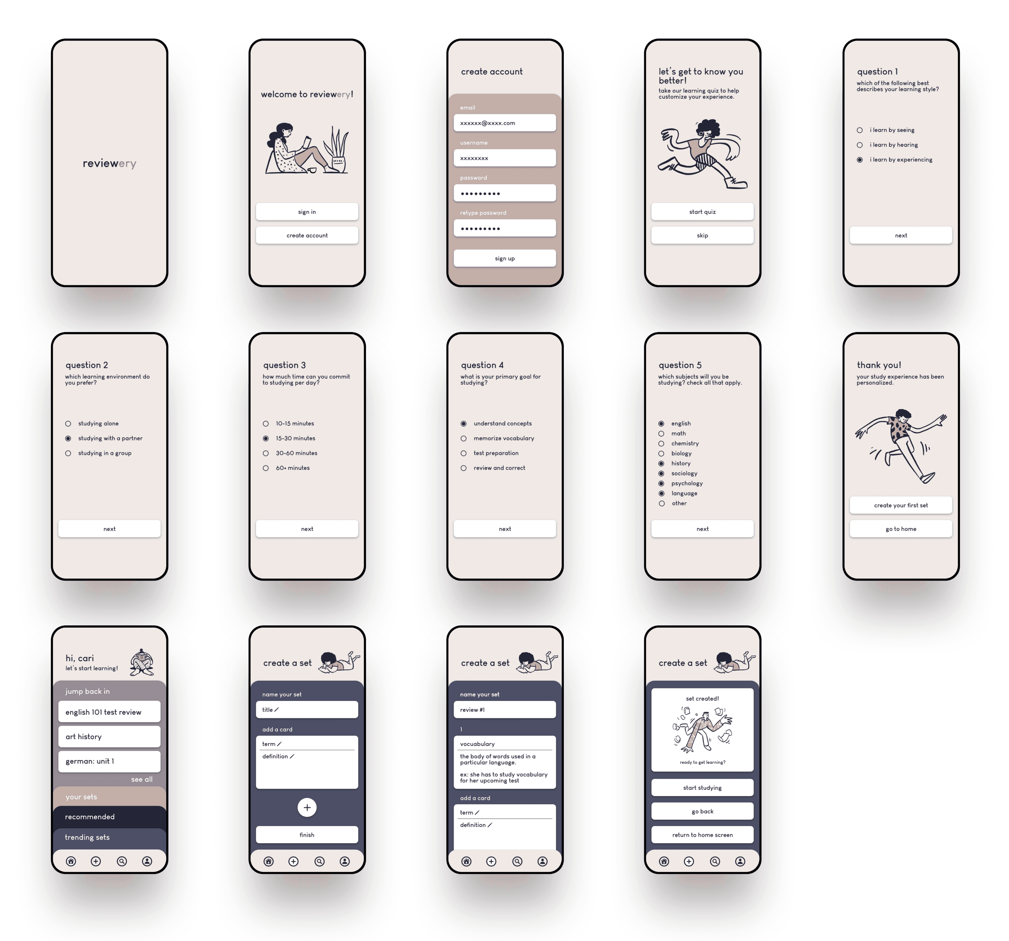
I created low-fidelity wireframes for the primary user flow to get a rough idea of reviewery’s design. These wireframes served as the basis for my final designs, as well as the key screens to be tested.
Ideate
Low-Fidelity Wireframes
I chose to do moderated usability testing with 3 potential users participating over Zoom. Like with my initial user interviews, these tests were conducted with students to stay focused on my target audience. Feedback was consistent between participants, as documented here.
Test
Usability Testing

Observations
The last options in the final question are a bit overwhelming
Easy to navigate- Straightforward and simple process
Mostly easy to find (my handwriting might have affected results)
Box to edit term/definition may be too large
Recommendations
Remove some options or create drop down menu
Make sure to use legible typeface and contrasting colors
Resize boxes
Task
Take Quiz
Create Account
Create Set
Add Term
Severity
2
0
1
1
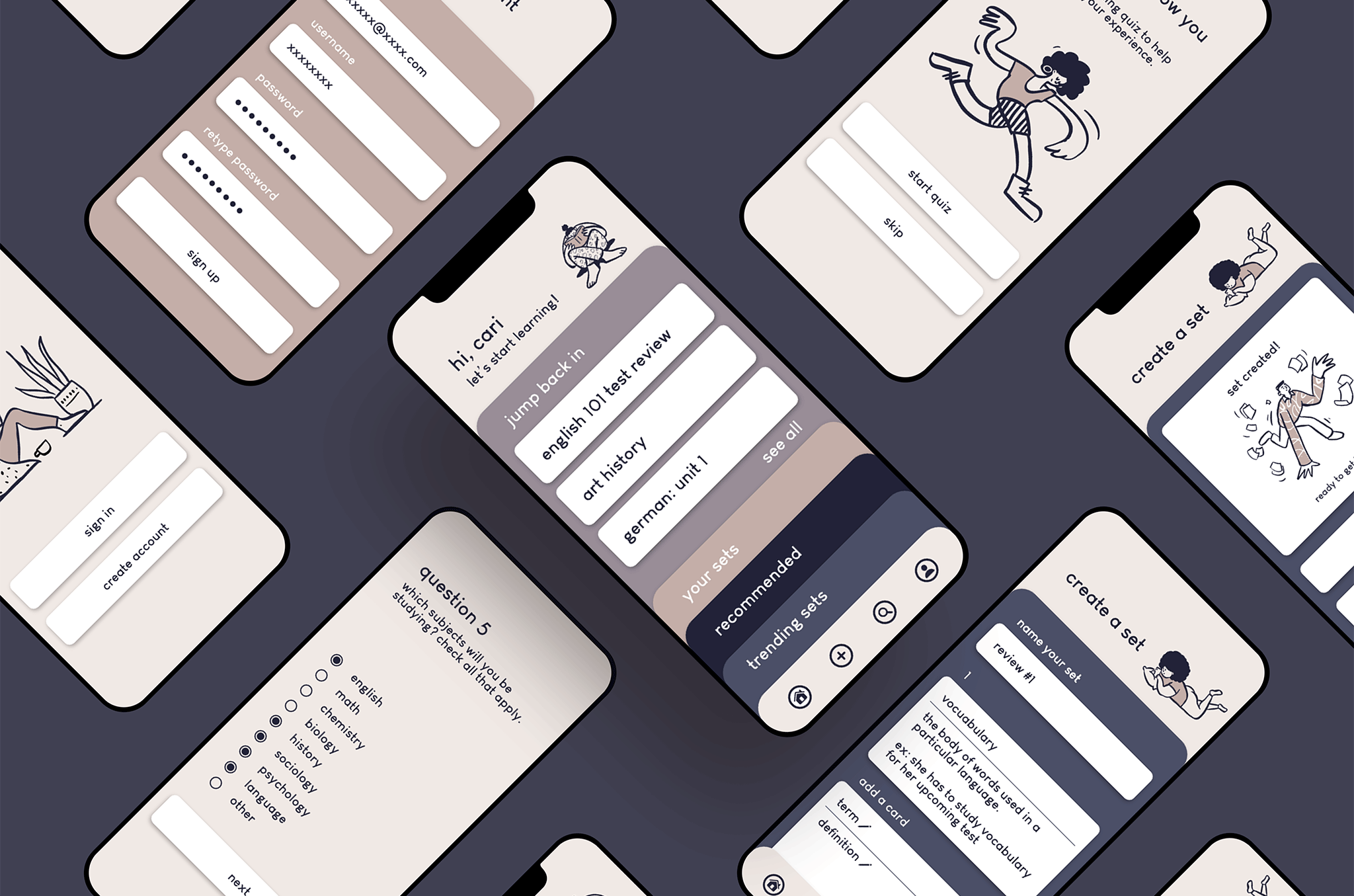
After analyzing feedback from user testing I was able to create high-fidelity wireframes that reflected any changes that needed to be made, as well as clean up the UI.
Design
High-Fidelity Wireframes
Final Designs
Final Mockups

reviewery was the first case study I’ve done and I think it turned out good considering I was also learning the UX design process as I went along. This was an introductory project I did for school, and because of this I did not get to expand on it as much as I would have liked to. In the future I would like to add more features to the app, mainly ones that show different ways to study the vocab sets since that is something I discovered is important to users. I would also like to design more he screens that I had planned out in my site map rather than just ones showing the main user flow. Overall, I think this was a great starting point for my UX journey.
Final Thoughts

UX/UI Case Study
January 2021 - February 2021